Live Activities - Train

OVERVIEW

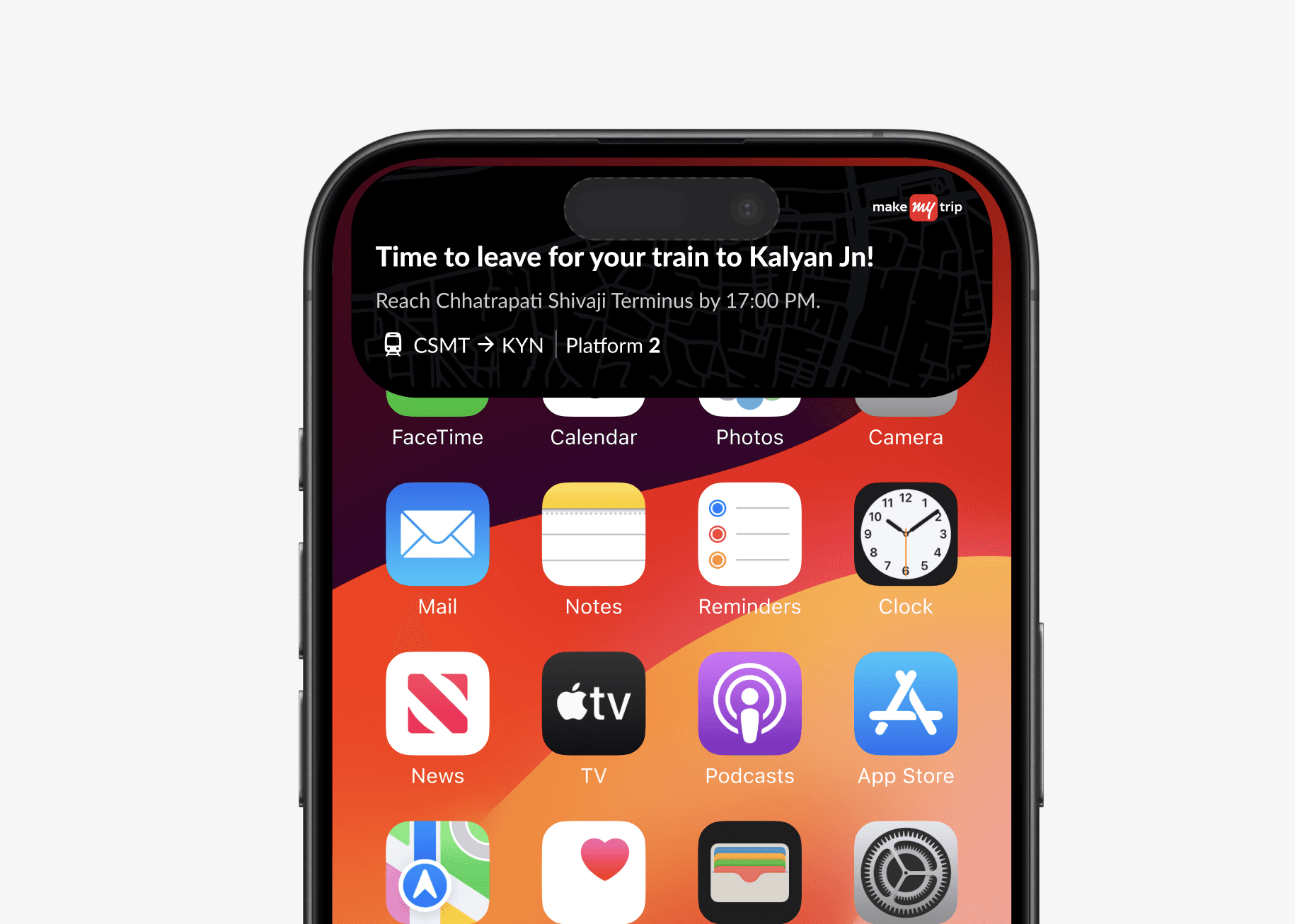
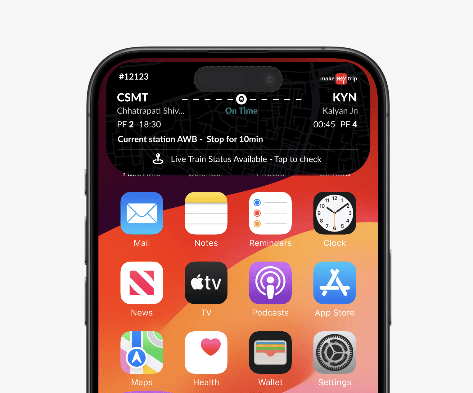
I designed an end-to-end notification flow spanning the entire travel journey—from pre-boarding to in-transit updates and arrival. The system adapts to complex scenarios such as varied boarding stations, delays, and long station names, while consistently prioritizing critical information like departure status, next stop, and estimated arrival. This ensures high clarity and glanceability across all travel stages, even in edge-case scenarios.

YEAR

2025

ROLE

UX Designer

SERVICES

Feature Revamp & Optimization
UX Research
UI Design

About Project

Previous Flow

The earlier Live Activity layout displayed only basic train details, without surfacing real-time status updates or contextual alerts. Delays, start station changes, and journey progress were not clearly highlighted, while critical information such as next station and updated arrival times lacked visual priority. This reduced clarity during time-sensitive travel moments, especially when trains were delayed or operating from alternate start stations.

Problem Statment

The previous notification flow made it hard for users to quickly understand train status and boarding context. Status states lacked clear differentiation, station logic was not immediately intuitive, and critical updates required extra cognitive effort to interpret. This increased confusion during pre-boarding moments and delayed timely decision-making for travelers.


Solution

The redesigned notification flow clearly distinguishes on-time, delayed, and cancelled states, prioritizes boarding context upfront, and surfaces critical updates at a glance. By improving visual hierarchy and status clarity, the experience enables faster decision-making and builds user confidence during pre-boarding moments.


PRD given by Project Manager

Ideation Phase

The ideation phase focused on uncovering gaps in the pre-boarding experience and improving clarity around train status and boarding context. Multiple concepts were explored to enhance glanceability, streamline information hierarchy, and support faster user decisions, with early visual and flow explorations used to refine the most effective solution.

Competitors


  • Uber – Uses live ride tracking with clear progress states to keep users informed in real time.

  • Zomato – Surfaces order movement and delivery timelines through dynamic, glanceable updates.

  • Swiggy – Communicates food preparation and delivery status with continuous live tracking.

  • Google Maps – Delivers ongoing navigation and travel updates with real-time contextual changes

  • .Delta Airlines App – Provides live flight status with detailed progress and operational updates.


Moodboard

The moodboard represents a clean, calm, and reliable travel experience designed for speed and clarity. It focuses on minimal layouts, strong visual hierarchy, and high-contrast status cues to ensure critical information is instantly scannable, enabling quick, confident decision-making during time-sensitive pre-boarding moments.

Final Design

2hrs before journey starts

Trains Status - On Time

Train Status - Before Time

Train Status - Delayed

Live Activities - Train

OVERVIEW

I designed an end-to-end notification flow spanning the entire travel journey—from pre-boarding to in-transit updates and arrival. The system adapts to complex scenarios such as varied boarding stations, delays, and long station names, while consistently prioritizing critical information like departure status, next stop, and estimated arrival. This ensures high clarity and glanceability across all travel stages, even in edge-case scenarios.

YEAR

2025

ROLE

UX Designer

SERVICES

Feature Revamp & Optimization
UX Research
UI Design

About Project

Previous Flow

The earlier Live Activity layout displayed only basic train details, without surfacing real-time status updates or contextual alerts. Delays, start station changes, and journey progress were not clearly highlighted, while critical information such as next station and updated arrival times lacked visual priority. This reduced clarity during time-sensitive travel moments, especially when trains were delayed or operating from alternate start stations.

Problem Statment

The previous notification flow made it hard for users to quickly understand train status and boarding context. Status states lacked clear differentiation, station logic was not immediately intuitive, and critical updates required extra cognitive effort to interpret. This increased confusion during pre-boarding moments and delayed timely decision-making for travelers.


Solution

The redesigned notification flow clearly distinguishes on-time, delayed, and cancelled states, prioritizes boarding context upfront, and surfaces critical updates at a glance. By improving visual hierarchy and status clarity, the experience enables faster decision-making and builds user confidence during pre-boarding moments.


PRD given by Project Manager

Ideation Phase

The ideation phase focused on uncovering gaps in the pre-boarding experience and improving clarity around train status and boarding context. Multiple concepts were explored to enhance glanceability, streamline information hierarchy, and support faster user decisions, with early visual and flow explorations used to refine the most effective solution.

Competitors


  • Uber – Uses live ride tracking with clear progress states to keep users informed in real time.

  • Zomato – Surfaces order movement and delivery timelines through dynamic, glanceable updates.

  • Swiggy – Communicates food preparation and delivery status with continuous live tracking.

  • Google Maps – Delivers ongoing navigation and travel updates with real-time contextual changes

  • .Delta Airlines App – Provides live flight status with detailed progress and operational updates.


Moodboard

The moodboard represents a clean, calm, and reliable travel experience designed for speed and clarity. It focuses on minimal layouts, strong visual hierarchy, and high-contrast status cues to ensure critical information is instantly scannable, enabling quick, confident decision-making during time-sensitive pre-boarding moments.

Final Design

2hrs before journey starts

Trains Status - On Time

Train Status - Before Time

Train Status - Delayed

Live Activities - Train

OVERVIEW

I designed an end-to-end notification flow spanning the entire travel journey—from pre-boarding to in-transit updates and arrival. The system adapts to complex scenarios such as varied boarding stations, delays, and long station names, while consistently prioritizing critical information like departure status, next stop, and estimated arrival. This ensures high clarity and glanceability across all travel stages, even in edge-case scenarios.

YEAR

2025

ROLE

UX Designer

SERVICES

Feature Revamp & Optimization
UX Research
UI Design

About Project

Previous Flow

The earlier Live Activity layout displayed only basic train details, without surfacing real-time status updates or contextual alerts. Delays, start station changes, and journey progress were not clearly highlighted, while critical information such as next station and updated arrival times lacked visual priority. This reduced clarity during time-sensitive travel moments, especially when trains were delayed or operating from alternate start stations.

Problem Statment

The previous notification flow made it hard for users to quickly understand train status and boarding context. Status states lacked clear differentiation, station logic was not immediately intuitive, and critical updates required extra cognitive effort to interpret. This increased confusion during pre-boarding moments and delayed timely decision-making for travelers.


Solution

The redesigned notification flow clearly distinguishes on-time, delayed, and cancelled states, prioritizes boarding context upfront, and surfaces critical updates at a glance. By improving visual hierarchy and status clarity, the experience enables faster decision-making and builds user confidence during pre-boarding moments.


PRD given by Project Manager

Ideation Phase

The ideation phase focused on uncovering gaps in the pre-boarding experience and improving clarity around train status and boarding context. Multiple concepts were explored to enhance glanceability, streamline information hierarchy, and support faster user decisions, with early visual and flow explorations used to refine the most effective solution.

Competitors


  • Uber – Uses live ride tracking with clear progress states to keep users informed in real time.

  • Zomato – Surfaces order movement and delivery timelines through dynamic, glanceable updates.

  • Swiggy – Communicates food preparation and delivery status with continuous live tracking.

  • Google Maps – Delivers ongoing navigation and travel updates with real-time contextual changes

  • .Delta Airlines App – Provides live flight status with detailed progress and operational updates.


Moodboard

The moodboard represents a clean, calm, and reliable travel experience designed for speed and clarity. It focuses on minimal layouts, strong visual hierarchy, and high-contrast status cues to ensure critical information is instantly scannable, enabling quick, confident decision-making during time-sensitive pre-boarding moments.

Final Design

2hrs before journey starts

Trains Status - On Time

Train Status - Before Time

Train Status - Delayed

Create a free website with Framer, the website builder loved by startups, designers and agencies.