MyCash Homepage

OVERVIEW

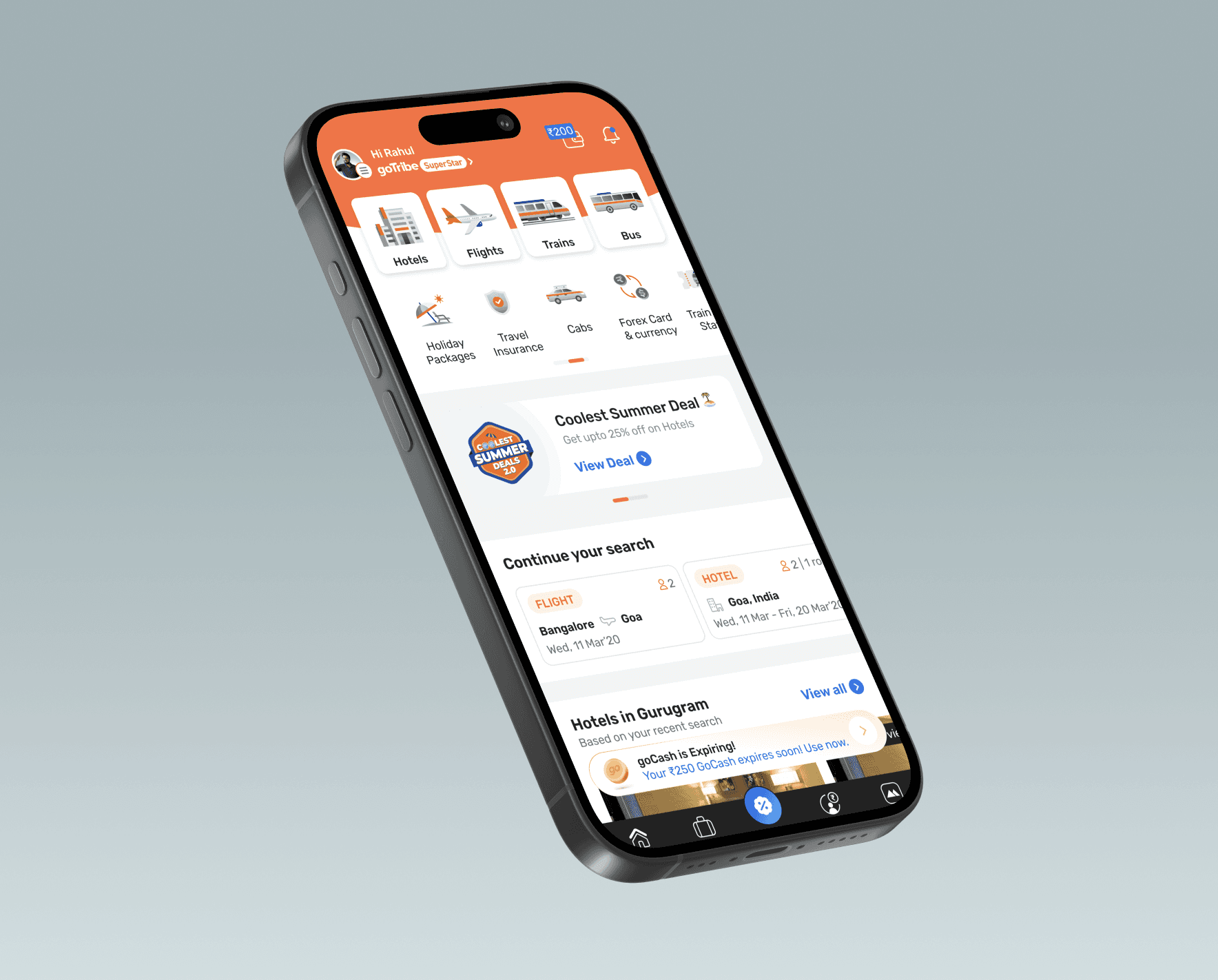
MyCash is a centralized wallet feature that allows users to view and manage all their cash rewards, refunds, and return credits in one place. It consists of two key components: Rewards are instantly credited after a successful payment and can be redeemed anytime for future bookings. Users earn ₹1 MyCash for every ₹100 spent on hotels, homestays, holiday packages, cabs, and buses, and ₹0.5 MyCash for every ₹100 spent on flight bookings. Refunds from cancellations or returns are also credited directly to MyCash, ensuring a seamless, unified balance that’s easy to track and use.

A laptop with a h32 word on it.
Image of 3 pixelated flat icons

YEAR

2025

ROLE

UX Design

SERVICES

UX Research
UI Design
High-Fidelity Prototyping
Goibibo

About Project

MyCash is a unified wallet feature that brings rewards and refunds into a single, easy-to-use balance. It simplifies tracking and redemption, encourages repeat bookings through instant rewards, and creates a seamless post-payment experience for users.

Problem Statment

The MyCash project tackles a critical visibility gap where users were often unaware of their available or expiring cash balances until they were lost. Insights showed that 40–45% of users missed using their MyCash due to poor discoverability, leading to unused rewards, increased complaints, and dissatisfaction. The project focused on improving awareness, clarity, and timely usage of users’ financial benefits.


Target Audience

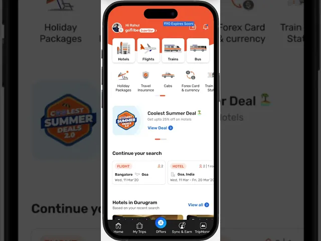
The project targeted users with high MyCash wallet balances (under ₹90 and above) who value convenience and timely nudges. The solution focused on targeted promotions and prominent homepage highlights that surfaced available balances at the right moments. This improved visibility encouraged timely usage before expiration and enhanced overall engagement with the platform.

PRD given by Project Manager

One User One Interaction

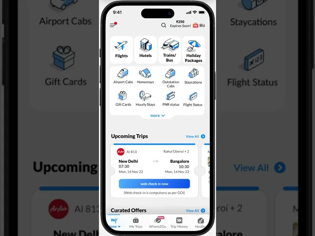
OUOA (One User, One Interaction) was strategically implemented for high-value expiries (₹100+) with a validity period exceeding 30 days. The experience is structured across key expiry milestones—30–20 days, 19–10 days, 9–7 days, and the expiry day—ensuring timely nudges, sustained engagement, and clear awareness throughout the expiry lifecycle.

Scroll Animation

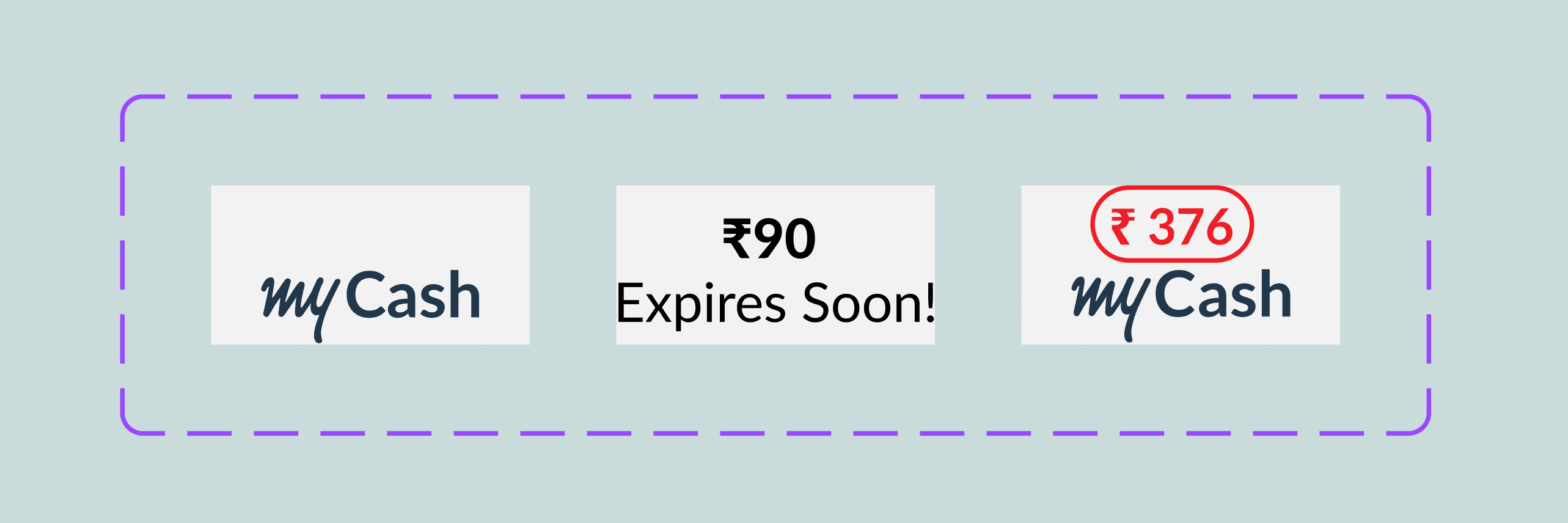
Expiry animations are triggered for medium and high MyCash balances, surfacing timely Tool tip alerts 3 to 30 days before expiry. These contextual cues proactively draw attention to expiring funds, improving awareness, driving timely usage, and reducing missed rewards.

Tool Tip - Very Urgent

This screen introduces contextual reminder tooltips for users with medium and high MyCash balances during the final 0–3 days before expiry. Clear, urgency-driven messaging highlights the remaining balance, prompting timely redemption while maintaining a focused, non-intrusive user experience.

Expand animation

This animation is triggered for users with medium and high expiring MyCash balances, running across a 3–30 day window. It appears 6–8 times during this period to maintain visibility without fatigue, ensuring users remain informed and are nudged to take timely action before expiry.

MyCash Homepage

OVERVIEW

MyCash is a centralized wallet feature that allows users to view and manage all their cash rewards, refunds, and return credits in one place. It consists of two key components: Rewards are instantly credited after a successful payment and can be redeemed anytime for future bookings. Users earn ₹1 MyCash for every ₹100 spent on hotels, homestays, holiday packages, cabs, and buses, and ₹0.5 MyCash for every ₹100 spent on flight bookings. Refunds from cancellations or returns are also credited directly to MyCash, ensuring a seamless, unified balance that’s easy to track and use.

A laptop with a h32 word on it.
Image of 3 pixelated flat icons

YEAR

2025

ROLE

UX Design

SERVICES

UX Research
UI Design
High-Fidelity Prototyping
Goibibo

About Project

MyCash is a unified wallet feature that brings rewards and refunds into a single, easy-to-use balance. It simplifies tracking and redemption, encourages repeat bookings through instant rewards, and creates a seamless post-payment experience for users.

Problem Statment

The MyCash project tackles a critical visibility gap where users were often unaware of their available or expiring cash balances until they were lost. Insights showed that 40–45% of users missed using their MyCash due to poor discoverability, leading to unused rewards, increased complaints, and dissatisfaction. The project focused on improving awareness, clarity, and timely usage of users’ financial benefits.


Target Audience

The project targeted users with high MyCash wallet balances (under ₹90 and above) who value convenience and timely nudges. The solution focused on targeted promotions and prominent homepage highlights that surfaced available balances at the right moments. This improved visibility encouraged timely usage before expiration and enhanced overall engagement with the platform.

PRD given by Project Manager

One User One Interaction

OUOA (One User, One Interaction) was strategically implemented for high-value expiries (₹100+) with a validity period exceeding 30 days. The experience is structured across key expiry milestones—30–20 days, 19–10 days, 9–7 days, and the expiry day—ensuring timely nudges, sustained engagement, and clear awareness throughout the expiry lifecycle.

Scroll Animation

Expiry animations are triggered for medium and high MyCash balances, surfacing timely Tool tip alerts 3 to 30 days before expiry. These contextual cues proactively draw attention to expiring funds, improving awareness, driving timely usage, and reducing missed rewards.

Tool Tip - Very Urgent

This screen introduces contextual reminder tooltips for users with medium and high MyCash balances during the final 0–3 days before expiry. Clear, urgency-driven messaging highlights the remaining balance, prompting timely redemption while maintaining a focused, non-intrusive user experience.

Expand animation

This animation is triggered for users with medium and high expiring MyCash balances, running across a 3–30 day window. It appears 6–8 times during this period to maintain visibility without fatigue, ensuring users remain informed and are nudged to take timely action before expiry.

MyCash Homepage

OVERVIEW

MyCash is a centralized wallet feature that allows users to view and manage all their cash rewards, refunds, and return credits in one place. It consists of two key components: Rewards are instantly credited after a successful payment and can be redeemed anytime for future bookings. Users earn ₹1 MyCash for every ₹100 spent on hotels, homestays, holiday packages, cabs, and buses, and ₹0.5 MyCash for every ₹100 spent on flight bookings. Refunds from cancellations or returns are also credited directly to MyCash, ensuring a seamless, unified balance that’s easy to track and use.

A laptop with a h32 word on it.
Image of 3 pixelated flat icons

YEAR

2025

ROLE

UX Design

SERVICES

UX Research
UI Design
High-Fidelity Prototyping
Goibibo

About Project

MyCash is a unified wallet feature that brings rewards and refunds into a single, easy-to-use balance. It simplifies tracking and redemption, encourages repeat bookings through instant rewards, and creates a seamless post-payment experience for users.

Problem Statment

The MyCash project tackles a critical visibility gap where users were often unaware of their available or expiring cash balances until they were lost. Insights showed that 40–45% of users missed using their MyCash due to poor discoverability, leading to unused rewards, increased complaints, and dissatisfaction. The project focused on improving awareness, clarity, and timely usage of users’ financial benefits.


Target Audience

The project targeted users with high MyCash wallet balances (under ₹90 and above) who value convenience and timely nudges. The solution focused on targeted promotions and prominent homepage highlights that surfaced available balances at the right moments. This improved visibility encouraged timely usage before expiration and enhanced overall engagement with the platform.

PRD given by Project Manager

One User One Interaction

OUOA (One User, One Interaction) was strategically implemented for high-value expiries (₹100+) with a validity period exceeding 30 days. The experience is structured across key expiry milestones—30–20 days, 19–10 days, 9–7 days, and the expiry day—ensuring timely nudges, sustained engagement, and clear awareness throughout the expiry lifecycle.

Scroll Animation

Expiry animations are triggered for medium and high MyCash balances, surfacing timely Tool tip alerts 3 to 30 days before expiry. These contextual cues proactively draw attention to expiring funds, improving awareness, driving timely usage, and reducing missed rewards.

Tool Tip - Very Urgent

This screen introduces contextual reminder tooltips for users with medium and high MyCash balances during the final 0–3 days before expiry. Clear, urgency-driven messaging highlights the remaining balance, prompting timely redemption while maintaining a focused, non-intrusive user experience.

Expand animation

This animation is triggered for users with medium and high expiring MyCash balances, running across a 3–30 day window. It appears 6–8 times during this period to maintain visibility without fatigue, ensuring users remain informed and are nudged to take timely action before expiry.

Create a free website with Framer, the website builder loved by startups, designers and agencies.